Posts
Last edited: Aug 1, 2022, 1:06pm EDT
Anthropocene Calamity, part 8: Climate models 101
This is part 8 of an 11 part series. For the introductory post to set the tone, please see Holy shit things are super bad. To learn about why we’re talking about climate models, please see It’s seat belt time.
Let’s start with the conclusion today: I made a really hokey little web tool that shows you climate model forecasts for the contiguous US over the next 70 years. If you want to just go check it out, you can! Click this map!
Okay are you back? Alright, let’s find out whether or not Cleveland is any good.
Climate scientists have, of course, had a huge head start on climate change. Climate science has known this would be a massive problem for a long time. “Greenhouse effect” is a term that is 113 years old, and the concern was advanced enough that the governments of the world convened a panel to study it fully 34 years ago. The scientists may not have had the power to do anything with the results, but they’ve continued to gather results. The science is extremely advanced and I am going to gloss over a ton of really important stuff in trying to simplify this for a short blog post.
The basic summary is that climate scientists use supercomputers to model as much of the Earth as they can, day by day, year by year, square mile by square mile. Water vapor, air speed, sun radiation, evaporation, soil moisture, elevation, land formations, everything that you can think of all goes into what’s called a GCM, or general circulation model. (You should know that Climate Science is the sort of field that seems to love a proliferation of acronyms.) Then, given a sufficiently powerful computer, a GCM will try to simulate one run through the possible system history of the Earth. They generate an enormous amount of data. GCMs can successfully reproduce the important properties of known weather over the last few centuries, and can then be turned to the future.
Many climate research groups have developed their own GCMs: GFDL at NOAA, Max Planck Institute, the UK Met Office, Canada’s Climate Research Division, France’s National Centre for Meteorological Research, the EC-Earth consortium, etc., etc. To try and learn from each other and make the best use of all of these different models, the World Climate Research Program (WCRP) started the Coupled Model Intercomparison Project (CMIP) to help support this cause. The CMIP project is now in phase 6. While I am eagerly looking forward to more readily available data from CMIP6, 2008’s phase 5 data is still very high quality and much easier to come by. Each CMIP phase sets target goals and provides guidelines for data interoperability so that scientists can analyze and interpret data from the various climate models together to compare or forecast using the combined wisdom of the models in what is called a model ensemble.
One downside of GCMs is that they are extraordinarily complex and take a huge amount of processing power. This improves each year, but to make any kind of progress, GCMs run on a very coarse resolution. GCMs often only consider the Earth as a grid made up of “pixels” that are 250-600 kilometers across, which is larger than most US states. This isn’t exactly helpful for regional planning, which is why the subdiscipline of “downscaling” exists. Downscaling is where we use the global climate modeling to provide initial and boundary conditions to a regional climate model run that runs on a much finer resolution but on a much smaller region of Earth.
Luckily, the WCRP also runs an effort known as the Coordinated Regional Climate Downscaling Experiment, or CORDEX. Considering just how much data is involved here (perhaps another post about that eventually, though not in this blog series), the different regions have been broken up into their own projects. The site for Region 3 (North America) is NA-CORDEX and it hosts detailed descriptions, documentation, and data for many projected parameters for runs of a variety of different models, scenarios, scaling resolutions, time frequencies, etc. I believe these are all “dynamically” downscaled, though my first time through all of this I used “statistical” downscaling when I picked where to move my family. Dynamical downscaling is what I would do now.
So let’s download all of this data! Here is my script that downloads a quarter terabyte. Don’t worry, I ran it for you. This script only downloads daily data for the three years around 2010 (so 2009, 2010, and 2011), the three years around 2050, and the three years around 2090. It only downloads data for the RCP8.5 scenario, in which emissions continue to rise (they are!). It downloads data with a pixel resolution size of 0.22° (15 miles). It downloads data that was bias corrected, in the sense that the data was generated from a run against known history, and was corrected given actual history. And yes, even with all of these filters, this uses a lot of disk space.
Once the data was downloaded, I then wrote a tool that generates a spreadsheet from all this data, calculating 2010, 2050, 2090 averages, deltas, and other summary values across nearby years and models such as wet bulb temperatures (calculated from projected humidity and temperature), days above a value, days below a value, average, min, max, etc. Further data processing added elevation and FIPS county code by latitude and longitude. I intend to eventually add data from one of my favorite data sources, the USDA Census of Agriculture, but have not yet.
Lastly, I wrote a tool that graphs all of this data on a map! It’s of the contiguous US and allows you to both select the color based on one of these values and filter regions based on these values. Like many projects, I used it as an excuse to learn new technology I haven’t used before (Dash), and so it’s kind of broken and not very good! Yay! Perhaps I can fix it with React directly. It’s terrible code but it’s better to have it in your hands than to have it not in your hands! As for other new-to-me technologies besides Dash, I do have to say Fly is delightful.
So, now to the fun part. Maps! You can click on each map to load the query that generated it. Once loaded you can zoom in and get specific values.
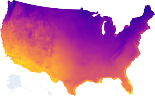
Elevation
Basic query first - here is all of the land that’s above 100ft of elevation and below 8000ft of elevation (not a mountain):
Sorry Alaska and Hawaii, my dataset doesn’t include you!
Why would you want this filter? The ocean’s rising tides are no joke and you probably want to avoid obvious flooding risk. But also living on top of a mountain has its own feasibility challenges.
Okay let’s get to harder questions.
Plant growth
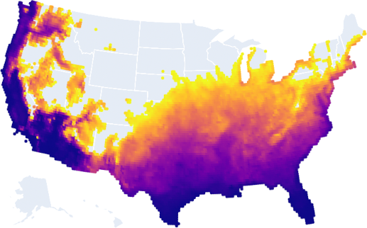
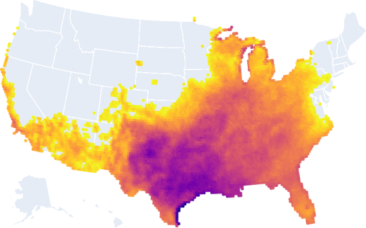
Here is all the land that is currently plant hardiness zone 5b or higher.
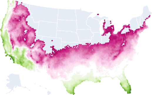
Why would you want this filter? Ultimately, you will probably want your region to be able to grow food, and the lower the plant hardiness zone, the harder it is. I picked 5b arbitrarily but a lot of stuff is grown in 5b+.
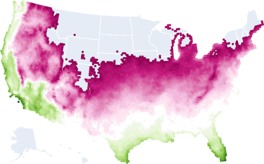
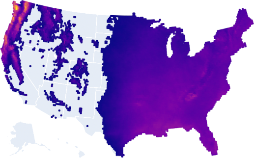
Okay, but the climate is changing! Here is all the land that will be plant hardiness zone 5b or higher in 2050+:
There’s another way to ask this question, which is the number of annual days at or below freezing. Here’s the land where there are 130 freezing days or less for 2050:
Water scarcity
Here is all the land that will get at least 20 inches of rain or snow annually in 2050+:
Why would you want this? To avoid droughts!
Alternatively, here is all the land that will have 220 days or less of no rain or snow annually in 2050+:
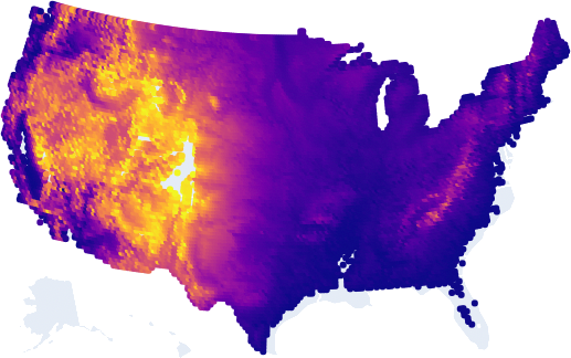
Heat
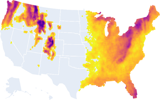
Here is all of the land that will have 20 or less days that hit 95 °F annually on average in 2050:
You want to avoid heat I’m assuming.
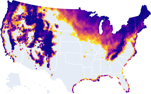
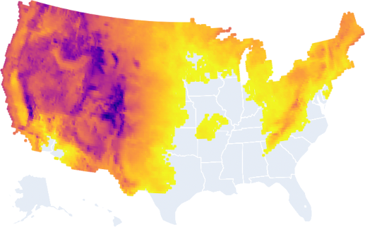
Here is all of the land that will have its average annual temperature change by 3 °F or less by 2050:
Why would you want this? You likely want a place where the climate isn’t changing drastically. If it is, it’s likely that existing infrastructure, plants, animals, etc., may struggle to adapt. Note that average temperature washes out a lot of extreme temperature swings, and this doesn’t account for that. I’m open to ideas for how to better graph temperature swings.
Here is all of the land that will have the average annual max daily average wet-bulb temperature be less than 79 °F.
The what? Okay so the data I have for wet-bulb temperatures is unfortunately daily averages per model run, which is not the same as daily maximums. So for each model, I find the day of each year that had the hottest daily average. That’s the annual max daily average. But then I average across models, so the average annual max daily average of the wet-bulb temperature. Sorry.
Why is this important? Humans literally can’t live if the wet-bulb temperature is 87 °F. 79 °F, especially for a daily average, is dangerously close if not already over the limit for parts of the day.
All together now
Okay, let’s combine all of these maps together!
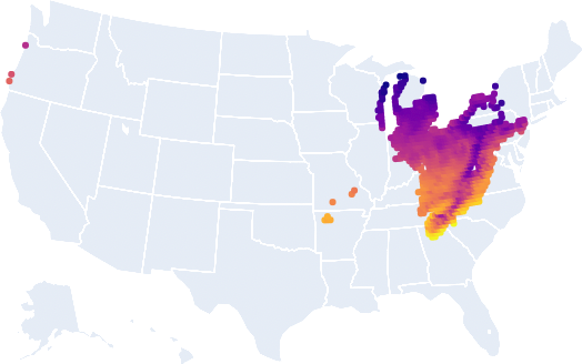
Fun times in Cleveland today! Surprise! For once, Ohio finally gets a win. In fact the whole rust belt looks good. This is convenient because the rust belt has excess infrastructure for their current population.
Instead of reading more from me about how to make use of this data for regional decision making, the Department of Defense commissioned climate scientists to write a report detailing how to do it. You should probably go read that before making large decisions with your life, but you probably should expect to make some large decisions with your life soon.
One thing that I don’t know how to make sense of: reporting about the recent UK heatwave says that climate scientists are saying the heat that hit the UK wasn’t supposed to happen until 2050, and it’s happening already. What does this mean? I don’t yet know, but it could mean that all the data I just shared with you is simply not pessimistic enough about our climate crisis. If you want, you might consider checking the 2090 data instead. Since I used the “business as usual” scenario, this model assumes that no mitigation has been performed at any date.
If you’re interested in doing more analysis, all of the code for my climate dashboard tool is on GitHub.
Check out the next post, where I talk about what we might want to consider as next steps.
- Part 1: Holy shit, things are super bad
- Part 2: Are you yelling until your voice is hoarse?
- Part 3: Every part of the pie must shrink
- Part 4: Your pie chart looks different than others
- Part 5: Sell Bitcoin, Save Lives
- Part 6: Are you spending your attention and money well?
- Part 7: It’s seat belt time
- Part 8: Climate models 101
- Part 9: Project Lifeboat
- Part 10: A personal update
- Part 11: Humanity can survive!
Thanks to Christy Olds, Jeff Wendling, and Moby von Briesen for advice and feedback on early drafts.